Design & Systems
Finding Your Way: What Physical Spaces Can Teach Us About UX
What a trip to Japan reminded me about finding our way through unfamiliar systems: good navigation is about more than pointing people in the right direction.


Trains. Taxis. Baggage claim. Exit.
Every airport is different, but they have a lot in common. The signs may use different colours, languages and symbols, but they point to places travellers need to find.
Even when one can’t read the native language, one can usually recognize a train or taxi symbol. We know roughly what we are looking for. We just need to figure out where to go next.
On a recent trip to Japan, I found myself paying more attention to how we navigate unfamiliar places.
And I started noticing some clever ways that the environment helped us find our way.
A line worth following
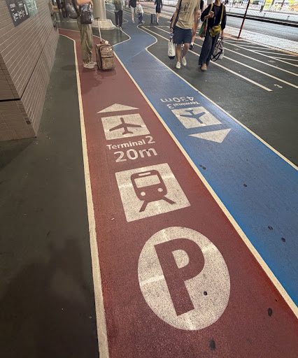
One of the things that caught my attention was the use of coloured pathways on the ground.
At one terminal, two coloured lines marked different routes. One led toward Terminal 2, just 20 metres away. The other pointed toward Terminal 3, another 430 metres down the way.
Each line had a colour, an arrow, a pictogram and a distance.
There was very little to figure out.
What I liked most was that the lines continued along the route. They didn’t just point us in a direction and leave us to figure out the rest.
We’ve all followed a sign with an arrow, only to reach another intersection and wonder whether we missed a turn.
A continuous line solves that problem. It gives you something to follow, with reassurance that you’re still headed in the right direction.
I noticed other examples throughout Japan.
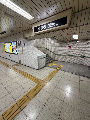
Yellow tactile paving ran along station corridors and through intersections. Raised bars provided directional guidance for people with visual impairments. Raised dots warned of stairs, crossings or other places requiring attention.
There were signs overhead, markings underfoot and pictograms at important decision points.
Different kinds of information, provided in different ways.
And importantly, the information appeared where people needed it.
Before entering the train platforms, for example, we needed to buy tickets. That meant finding the correct ticket machines and understanding which tickets we needed before reaching the gates.
It wasn’t enough to know where the train was. We also needed to know what to do before we got there.
Finding our way online
We navigate websites in much the same way.
We look for clues that tell us where we are and which direction to take.
Headings. Menus. Links. Buttons.
In user experience design, we call these clues information scent. The words and visual cues help us predict what we’ll find if we follow a link.
But unlike an airport, where most people enter through a fairly predictable sequence, visitors can arrive almost anywhere on a website.
A search result might take them directly to a page several levels down. A colleague might share a link. Someone using an AI assistant might follow a cited source to verify information.
AI may help people find answers, but it doesn’t eliminate the need to navigate websites. People still need to register, complete applications, submit forms and carry out transactions.
And when they arrive, they need to figure out where they are.
The trouble is, the path isn’t always as clear as a coloured line on the floor.
When the wrong path looks right
Imagine you’re looking for professional development.
You discover that a university offers a leadership program that interests you. You visit the website and start reading about the courses, admission requirements and tuition.
Everything seems relevant.
Partway through, you realize you’re reading about the full-time master’s degree, not the part-time hybrid program you are interested in.
You’ve been following the wrong path without knowing it.
This happens frequently on large websites, especially those with many departments, programs and overlapping areas of information.
The labels may be accurate. The links may work perfectly. The information may even be useful.
But none of that guarantees you’re headed toward the right destination.
Sometimes the problem isn’t that people can’t find a path.
It’s that the wrong path looks more promising than the right one.
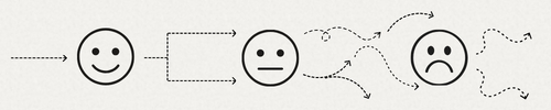
Maybe the correct link is further down the landing page. Maybe a more prominent button leads somewhere else. Maybe two programs use nearly identical names. It’s also possible that the site architecture has placed the hybrid program listed in a completely different area due to its alignment with a different department of the university.
People make decisions based on the information in front of them.
If the cues are misleading, they may make perfectly reasonable decisions that take them somewhere they never intended to go.
Design for the whole journey
When we design websites and digital services, we often focus on individual pages and tasks.
Can people find the information? Is the button visible? Can they complete the form?
Those are important questions.
But they don’t tell us whether someone can navigate the entire journey without getting lost.
The coloured pathways I saw in Japan reminded me that good wayfinding doesn’t stop after the first sign/decision.
It continues to provide direction. It helps people recognize when something changes. It gives them the information they need before they reach the next step.
Digital services need to do the same.
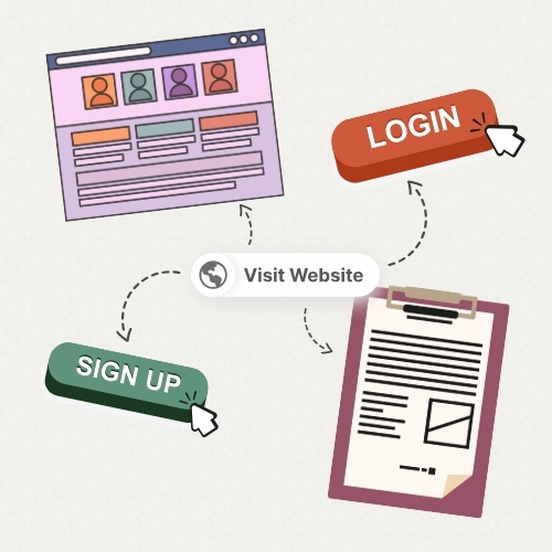
That means making it clear which program, service or process someone is viewing on the screen in front of them. It means providing instructions before they’re needed, not just throwing errors after someone has made a mistake.
And it means paying attention to the other links, buttons and messages that compete for attention along the way.
Too much information can be just as confusing as too little.
The goal isn’t to explain everything. It’s to help people make the next decision with confidence.
Walk the path like a stranger
Here’s a simple exercise for anyone responsible for a website or digital service.
Choose something important that your customers need to accomplish.
Start where they might actually arrive. Perhaps that’s a Google search result, a shared link or a page recommended by an AI assistant.
Then follow the journey from beginning to end.
At each step, ask yourself:
- Where am I?
- What information do I need before I continue?
- What looks like the next step?
- What tells me I’m still going the right way?
- What else looks like the right path, but isn’t?
Pay particular attention to that last question.
The correct path may be there. But if another link, button or heading looks more promising, people may never find it.
You don’t need to make your website as simple as a line on the floor.
But you can learn something from one.
Don’t just show people where to start. Help them stay on the right path, all the way to their destination.